Typographic Calendar
Graphic Design
Goal
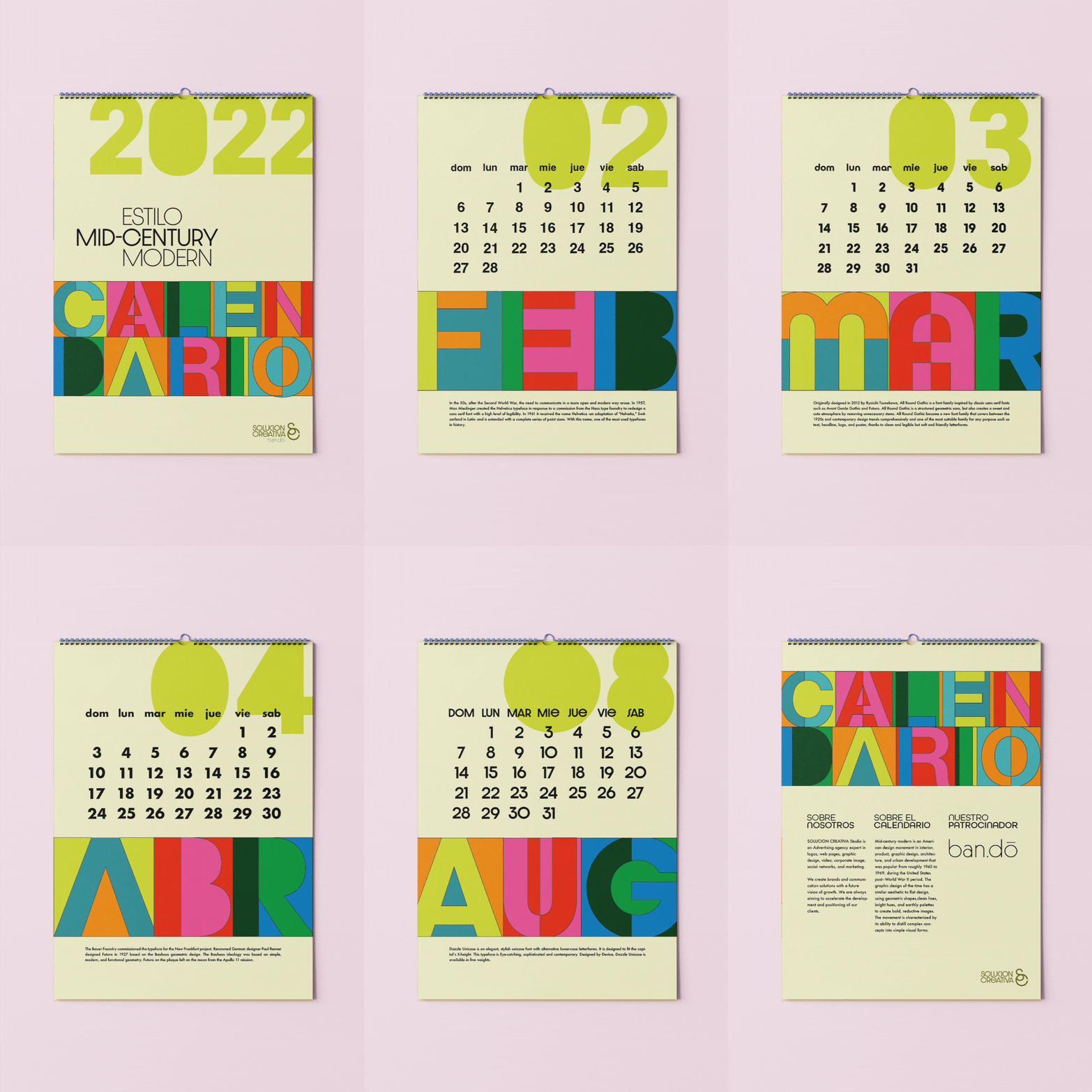
The Mid-Century Modern Calendar – a captivating journey into the iconic design era of the mid-20th century. This calendar is a celebration of the timeless aesthetic that defined the period: a fusion of flat design principles, geometric shapes, clean lines, and vibrant hues. Typography takes center stage as I've carefully selected a unique typeface for each month, ensuring it harmonizes seamlessly with the mid-century modern theme. What sets this calendar apart is my approach to typography – breaking down each character into distinct sections, each adorned with different colors. This approach allows viewers to appreciate the intricate shapes that form each letter, enhancing the overall experience.
A calendar that embraces typography inspired by the iconic mid-century modern design.


